
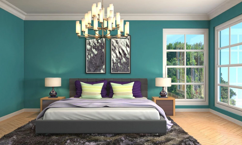
Turquoise walls have a cool, lively character, while wood introduces warmth and natural texture. The combination can feel balanced when the finish on doors, cabinets, furniture or wall panels responds to the undertone of the paint. Instead of choosing a wood shade in isolation, consider how both surfaces will look in daylight, artificial light and the wider room scheme.
Start with the Turquoise Undertone
Turquoise may lean towards blue, green or a softer greyed tone. Identifying that undertone makes it easier to select a wood finish that feels connected rather than added later.
People reading about ‘How to make Turquoise colour?’ can also understand why the balance of blue and green matters. A blue-led turquoise often works with neutral or cooler timber tones. A greener turquoise can sit comfortably beside honey, teak-inspired or warm brown finishes. Always compare samples next to the painted wall before deciding.
Choose Light Finishes for an Airy Look
Light wood finishes keep the room open and allow turquoise to remain the main colour. They can suit wardrobes, shelves, doors and larger furniture where a deep brown might feel visually heavy.
A pale finish should still reveal enough grain to prevent the wooden surface from appearing flat. Beige, sand and light oak tones generally create a gentle transition between the wall and the timber. Keep nearby metal fittings simple so the palette does not become crowded.
Add Depth with Medium Brown Wood
Medium brown finishes bring more definition without creating the strong contrast of very dark wood. They can ground a turquoise wall and make wooden elements easier to notice.
When choosing from available wood coatings, assess the timber condition, required sheen and daily use of the surface. The same coating may not suit every item. Doors, dining furniture and decorative panels can face different levels of handling, moisture and cleaning.
Retain the Grain with a Wood Stain
Where visible grain is part of the design, Nerolac Wonderwood Wood Stains can be considered. The product is intended to colour wooden surfaces while allowing their natural grain to remain visible, making it relevant beside a strong wall shade such as turquoise.
Select the stain tone according to the depth of the wall colour. Lighter stains soften the contrast, while deeper brown stains give the room more structure. Test the stain on a concealed or spare piece first, as different timbers may absorb colour differently.
Match the Sheen to the Room
Sheen changes how both wood and turquoise respond to light. A glossy wooden finish reflects more light and appears sharper. A lower sheen gives a quieter, more natural effect.
- How much daylight reaches the wooden surface
- Whether the timber has scratches or uneven areas
- How often the surface needs cleaning
- Whether other wooden items have a similar sheen
Keeping one main finish across connected surfaces usually gives the room better visual continuity.
Prepare Wood before Applying a Finish
Clean the wood and remove loose or damaged previous coatings. Sanding may be required to create an even base. Dust, moisture and surface irregularities can affect how a stain or clear finish settles.
Follow the product instructions and allow each stage to dry properly. Good preparation helps the chosen tone look even beside the turquoise wall.
Final Thoughts
Turquoise walls pair well with wood when undertone, grain, shade and sheen are considered together. Light finishes keep the space gentle, while medium or dark browns add definition. Test both wall and wood samples in the room, then choose a coating suited to the timber and its everyday use.