
Choosing the paint color of a space isn’t just about which color you think will look good. The color of your home or office impacts how you feel in the space. The colors of the room can impact your mood, stress levels, energy, and creativity.
When designing a space, what helps is knowing the primary function of the room, how you want to feel when you are in there, and how you want others to feel. You could want a cozy space to relax with a book or a cup of coffee, a workspace brimming with energy and productivity, or even a meditation room with calmness and serenity. The colors you choose can help you set the tone and create the vibe of the room.
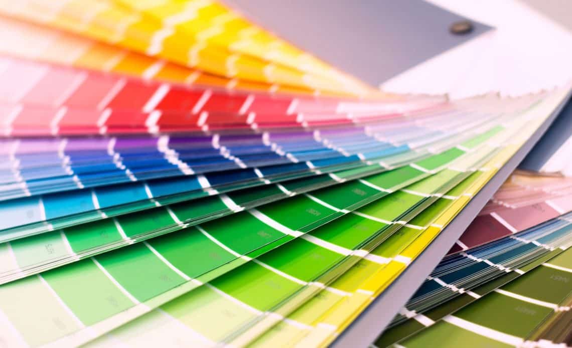
Knowing the psychology of color is a handy visual tool that you can use to your advantage when picking the color palette for a room.
- Red: Red is a stimulating color that can heighten the senses. If you want a space full of energy and excitement, red is your go-to. Based on the shade and context, red can feel romantic, intimate, traditional, contemporary, timeless, or rustic.
- Pink: Pink is a soft and delicate color from the red family and is more tranquil than red. It adds a touch of innocence and sweetness. While pink can reflect a lot of feminine energy, using it with a neutral tone like gray or brown can bring a good balance. Some shades like fuchsia pink can suggest glamour and energy.
- Orange: Orange is a high energy color and symbolizes warmth, enthusiasm, and vibrancy. Orange can instantly add playfulness and a sense of fun to a space. It blends well with neutrals and is a great way to add a pop of color to a space. Brown-based shades of orange like burnt sienna or a terra cotta can bring vibes of nature and can have a calming effect.
- Yellow: Yellow is a happy and uplifting summer color. It represents optimism and warmth and can make one feel joyful and energetic. Yellow and its shades are ideal for accent walls.
- Green: Green is a major color of nature and can have a soothing and calming effect. It is great for creating a space with a vibe of peace, balance, and positivity. Go for muted tones like forest green or a dark olive for a more soothing room, and a brighter shade like green apple for a cheerful room.
- Blue: Blue has been known to have a calming and sedating effect. It is a perfect color for a home office as it aids concentration. It is one of the most versatile colors to work. From toned down pastels to bright turquoise, any shade of blue will make you feel cool, calm, and relaxed.
- Purple: Purple is the color of royalty and speaks of abundance and wealth. It also represents mystery, imagination, and magic and can be used to give a burst of energy to a space. Lighter shades like lilac and lavender can create softness and calmness in the energy.
When done in the right way, the color and set up of a space can have a profound effect on the harmony of the space and the well-being of the people living in it. You can check out an extensive range of splendid colors in Asian paints Apex paint.
Aapka Painter is a premium painting service provider that brings in technology, automation, and service guarantee. Our paint visualizer provides the perfect way to create inspiration boards according to your taste and choices. We manage the entire process online, from project management to payment, Asian paints price 1litre, paint selection, etc.