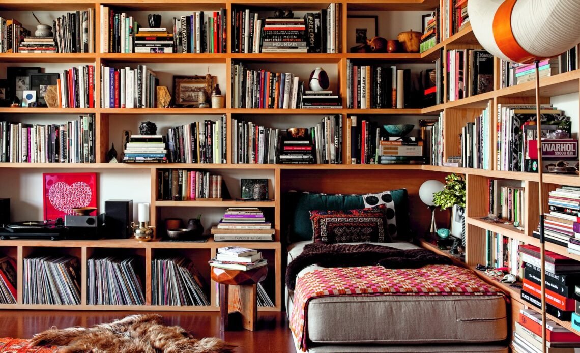
Walk into any bookstore and the problem becomes clear. There are hundreds of books competing for attention, spines jammed against one another on the shelf, covers out and proud on display tables. For an author or publisher, getting a book noticed in that environment is no fluke; it’s about making the right design decisions that play into the reality of retail.
The simple truth is that most books get at most seconds of attention. Someone scanning a shelf looks at spines, maybe pulls one or two that look interesting, flips them over to read the back and decide whether to buy or replace. All of this takes place in the blink of an eye. It’s the physical attributes of the book that govern most of those snap decisions.
Size and Format Create Instant Impressions
The size and format of a book give signals before anyone reads a word. A big, thick hardback connotes importance. A little paperback seems friendly and cheap. An oversized book suggests something visual or display-worthy rather than just a read.
Decisions about size and format count for more in retail than they do online. Offline, a book has to compete with whatever else is on the shelf or table real estate. Using A4 Hardback Book Printing Services to produce books in larger formats creates an immediate presence that other sizes can’t hold a candle to. The extra inch or two adds height to the spine. The sheer solidity of a hardback format adds an element of perceived value.
Size isn’t everything though. The format also has to fit the book and its audience. An oversized hardback for a novel? That’s just weird. A paperback in a small format for a photography book? That does the content a disservice.
Spine Design Gets Overlooked Too Often
Most books sit with their spines out when shelved. This means that the spine is the first (and often only) part of the book that a potential reader sees. Spine design however gets way less attention than cover design, which is evident.
A good spine conveys readable text from a distance. This means that the font has to be legible, there has to be enough contrast with the background, and it has to be big enough to read when scanning a shelf from a couple of feet away. Fancy scripts or overly decorative fonts might look good up close but they’re not readable from distance – even if it’s just a few feet.
Colour matters too. A bright or distinctive colour for a spine helps it pop among other books – many of which are likely to have similar colour schemes. This doesn’t mean making it garish, but it at least has to be noticeable.
The name of the publisher, author and title all have to fit somewhere. There’s not much space on a spine, so each element has to earn its place rather than fight for it. Overwhelming potential readers with too much information does no one any favours.
Cover Finishes Add Tactile Appeal
The cover of a book is what potential readers see before they open it, and it’s often picked up by hand. Texture matters as much as visual appeal here.
The design finish on the cover might be matte or gloss. It might have rough patches or ridges that encourage touch, or be perfectly smooth throughout. It might feature spot UV detailing that takes it to the next level in terms of premium look and feel. These finishing touches are important when it comes to hardback books, which come in more varieties than paperbacks do.
Cover Colour Choices Signal Genre and Tone
Certain genres have certain colours on their covers. Thrillers are often dark with red elements. Romance novels lean toward pastels or bold jewel tones. Literary fiction opts for neutral palate colours that don’t shout “read me” but rather convey depth.
Breaking those conventions is often risky, but can pay off well. A thriller with a pastel cover might attract attention – assuming people don’t overlook it because it looks unappealing.
Taking typography into account when designing a cover goes hand in hand with colour choices. Bold, chunky type conveys different connotations than elegant serif fonts or hand drawn lettering.
Making Design Decisions That Work in Retail
Designing a book for retail means considering how it will actually exist in the physical world as opposed to how it photographs and appears as a digital thumbnail online.
In offline retail environments, books need to work in multiple spatial contexts. They need to appeal from great distances (think across a room), look appealing when picked up, and feel like something worth buying when held in the hand.
Size and format, spine design, cover finish and cover colour all contribute to an impression that gets formed rapidly by browsers looking for their next read. None of these elements go about their business in isolation though; an amazing cover can’t fix an unappealing spine that’s easily missed among hundreds of others on a bookshelf. An easily overlooked cover won’t convert browsers into buyers no matter how impressive its content may seem when read on a good display screen.

